AI Product Photos From Pictures You Already Have
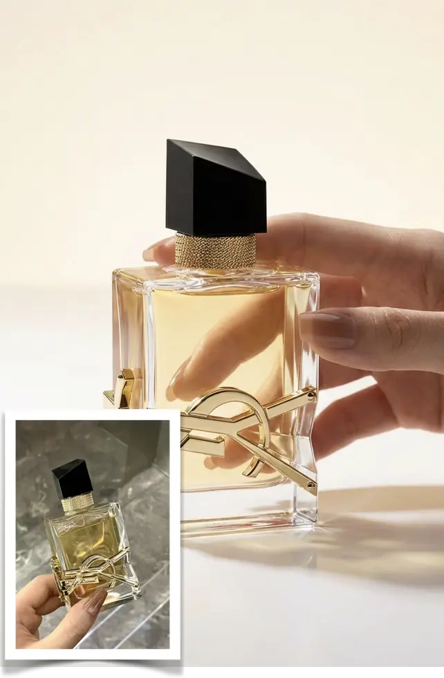
Most small sellers already have the raw material: a few phone photos of the product on a desk, held up to a window, or shot on a stall table. What spoils them is rarely the product. It is the socket on the wall behind it, the yellow cast of a ceiling bulb, the fingers at the edge of the frame.
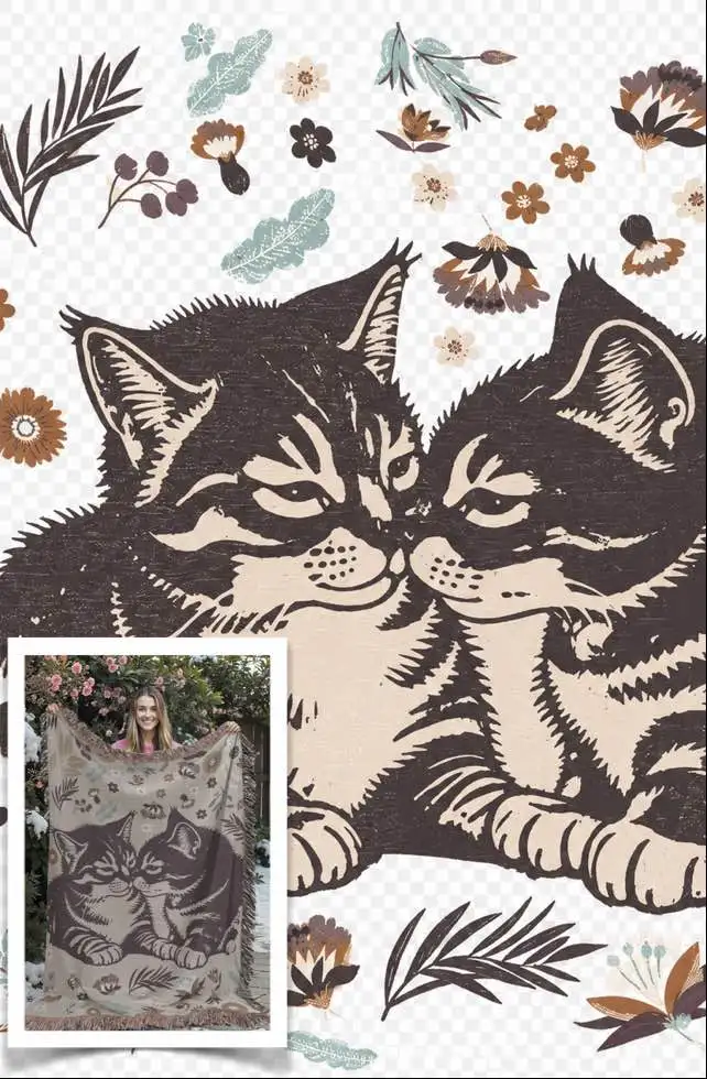
That is the job AI product photos do here: take one of those shots as the source and rebuild the light and the background around it. A studio backdrop with a believable shadow, a plain white background for a listing, or the printed artwork lifted off a towel so it can be reused on packaging. Treat it as a second pass, not a rescue. If the source is soft, badly exposed, or the product sits in one corner of the frame, there is little to work from and the tool will fill the gaps with detail that was never there. Shoot once more instead; two minutes with a window, a lamp and a sheet of paper beats an hour of rewriting a prompt.
Which jobs this actually covers
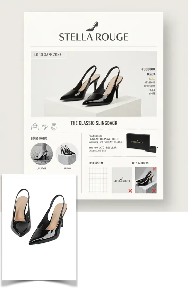
The templates answer four different needs and they are not interchangeable. A studio shot places the product on a lit background with a believable shadow, which is what you want for the second or third image in a listing. A plain background version is the one that gets past marketplace rules for the main image. Pattern extraction ignores the object completely and redraws the graphic printed on it, useful for textiles, mugs and packaging. A brand poster turns a single product photo into a page of palette, type samples and layout rules.
It works when the source is sharp and the whole product is inside the frame. It is the wrong tool when the value sits in details that have to stay exactly as photographed: engraving, stitching, a stamped serial number, the precise shade of a fabric. It is also the wrong tool for hiding a defect, changing an apparent size, or making a product look like something it is not. Returns, colour complaints and platform checks all come back to the photo you started from.
Save a copy of the original before uploading anything, in a different folder from the one you upload from. You will compare the result against it, and some marketplaces ask for unedited photos when a listing is disputed.
Step by step, from camera roll to listing image
Decide which image you actually need before you open a template: a clean main image, a scene shot, or just the print on its own. One source photo can feed several of them, but change one thing at a time or you will not know which change helped.
- Pick the source frame. Take the sharpest one where the product sits fully inside the frame with a little empty space around it, then zoom to 100% and check the label, the logo and the material texture. Do not judge the source by how clean the background is.
- Crop before you upload. Cut out the table edge, your fingers and any stray packaging, straighten the product, and export at the largest size you have. Compressing the file first throws away exactly the fine edges the tool needs.
- Choose the template that matches the outcome, not the product. Studio Shot Product for a lit scene, printed-design extraction when the graphic is the deliverable, a brand layout when one photo has to carry a whole visual identity.
- If the template accepts a description, make it specific. Name the surface, the direction of the light and whether the shadow is hard or soft. Words like premium or modern carry no information, so the model guesses.
- Zoom to 100% on the result and check three things in order: the outline of the product, the lettering on the label, the reflections and the shadow. Read the label out loud, since swapped or merged letters are the most common defect.
- Rerun rather than over-fix. If one area is wrong, change the crop or shorten the description and generate again. Repeated local corrections on the same output tend to smear the texture.
Making a batch look like one shop
A buyer sees several thumbnails at once on a category page. Images that disagree on colour temperature and shadow direction read as stock from different sellers, even when each one is fine on its own. Most of that consistency is decided at the camera, not in the wording of a prompt.
- Shoot a batch in one session. Same room, same lamp, same distance and height, so the generated backgrounds and shadows agree with each other.
- Check edges and reflections at 100%. Transparent bottles, glossy cartons, chrome and dark products on dark backgrounds are where outlines get eaten. The silhouette and the reflection under the object are what make it look placed rather than pasted.
- Read every label out loud. Small text is redrawn rather than copied, so letters can merge or swap. When the label is part of the sale, keep the real photo as the main image and use the generated one further down the set.
- Pick two or three styles and stay there. A different background for every product looks random even when each image is good, while one backdrop across a range starts to look like a brand.
- Check the platform rules before anything else. Most marketplaces want a plain white or light background on the main image, the product filling most of the frame, and no text, watermark, borders or props. Keep one compliant version of each product and put the styled ones after it.
Where it breaks down
The failures are fairly predictable. Thin repeating structures such as a chain, a zip, basket weave or radiator slats come back merged, or with a piece added. Lettering on packaging gets rewritten. Glossy objects keep a reflection of a background that is no longer there. And when you replace the background completely, the shadow under the product often points at a light source that does not match the new scene.
When a run goes wrong, step back instead of pushing forward. Crop the source tighter so the product fills more of the frame, or lower the ambition: keeping the original background and only fixing the light and the shadow is far easier than moving the object into a new scene. For a range of products, get one image right first, then reuse the same template and the same wording on the rest so the whole set stays in step.
Keep the original photo and one untouched copy of every generated file. Colour complaints, returns and marketplace checks are settled with the photo you started from.
What to do with the finished files
Generated files usually come back in the one-to-two-thousand-pixel range. That is fine for a listing and thin for print, so order matters: finish the image first, enlarge it last. Replace the background and crop to the final ratio, then upscale with a light sharpen as the final step. Upscaling early and cropping twice afterwards wastes the run, and the same file should not be enlarged twice.
It also pays to keep the plain and the styled versions apart. The white background file stays untouched for the main image, and each scene version is generated separately from the same source: on a table, in a hand, next to the packaging. Name files with the SKU and the purpose, and note the wording that produced each one. When you need a fourth image three months later, that note is the only way to match what you already published.
FAQ
- Can I shoot the source photo with a phone?
- Yes, as long as the frame is sharp and the product is fully inside it. Shoot beside a window with the light coming in from the side and something white on the opposite side to open up the shadows. Turn the flash off, and avoid digital zoom, which crops away the pixels before the tool ever sees them.
- Why did the text on my label change?
- Small lettering is redrawn rather than copied, so letters can merge, disappear or be replaced. If the label carries information a buyer needs, keep the real photo on the main image, or reshoot with the label filling more of the frame so there is more to work from.
- Do I need a white background for the main image?
- Most marketplaces do ask for a plain white or light background on the first image, and many reject text, watermarks, borders and props on it. Produce one compliant version of each product, then use the styled backgrounds and scene shots in the slots after it.
- How many images can one source photo produce?
- Several, but two to four are usually the ones worth publishing and the rest differ only slightly. Keep the palette and the light direction identical across them. A small set that clearly belongs together is easier to maintain when the product or the packaging changes.